Backbone.ModalDialog.js v0.3
Recently at work I gave my Backbone.js modal dialog a good run out on a fairly complex edit profile screen. Each distinct element of a user’s profile is editable separately in a modal dialog. I made a few changes along the way so now here’s the 0.3 release.
The changes in v0.3 are :
- Added option showModalAtScrollPosition (default true) to determine whether the modal dialog is displayed so it is visible in a scrolled viewport (a sensible default), or is displayed at the top of the document where it might be invisible if the window has been scrolled down.
- Fixed a problem where the opaque blanket div didn’t cover the entire screen when the window was scrolled. The modal blanket div’s height is recalculated every time a dialog is displayed (in case the window height has changed since last time).
- Added the recentre() function which you can call to recentre a modal dialog in case the content has changed. Useful if errors messages have been added for example. Americans can use recenter().
- Improved how the positioning works.
- The showModal() function now returns this.
- Added validation to the demo using Thomas Pederson’s excellent backbone.validation.js.
See the demo page live in action.
Backbone.ModalDialog.js v0.2
I’ve made a few changes to my Backbone.js modal dialog plugin. I’m using it in my own web app and I needed to make some changes and hopefully others will need them too.
Here’s a quick demo :
The new features are :
- Added option to render the modal dialog into a given container element allowing relative absolute positioning.
- Added option to slide the modal dialog down from above or up from below.
- You can now provide an css properties to be applied to the modal dialog.
- Clicking on a jQuery ui calender control no longer causes the modal dialog to close.
- Improved the default position of the modal dialog to be more central.
Happy modalizing.
PS: The YouTube video quality is quite poor isn’t it, looks ok outside of YouTube. What’s wrong with it? Can anyone recommend a YouTube compatible screen capture app?
Using jQuery to display a form validation error
I’m obsessed with best practice form design and usability. There are lots of guidelines about validation messages.
I’ve decided on a way of displaying validation errors and success messages on forms for my current project. I’ve turned this into a jQuery form error plugin on GitHub which provides some quick wins :
- A single function call to display a validation message next to a field.
- A single function call to remove a validation message and optionally displays a success image in its place.
- No additional css is required.
In the GitHub project you’ll find the Index.html which demonstrates a simple form with some validation. Here’s a video of the plugin in action :
How do I use jquery.formError?
First of all you need to know when a form control has invalid data because it’s then that you want to call the plugin. I’ve kept the validation logic in the demo simple so the focus is on the plugin. If you’re using Backbone.js I can recommend the excellent backbone.validation plugin as it has the required valid/invalid callbacks you’ll need.
First you’ll need to include the jQuery.formError.js plugin javascript file. Then, to display a validation error message on an input with an id of “name” :
	$("#name").formError(
	"Name cannot be greater than 15 characters long");
To remove the validation message when you have successfully revalidated the value :
$("#name").formError( {remove:true});
By default removing the validation message will place a validation success image in place of the error. So you’ll need an icon for this like the one in the demo. To disable this behaviour :
	$("#name").formError({
   remove:true,
   successImage: {enabled:false}
});
The default image url is just “success.gif” which you can easily modify on a per-call basis :
	$("#name").formError({
   remove:true,
   successImage: {src:"img/success.gif"}
});
The plugin also gives an invalid control the css class invalid. I leave it up to you to decide the visual effect .invalid has on the control. In the demo.css file you’ll see that it applies a red border. This css class is removed when you remove the error message.
Why not put the validation message underneath the control?
It’s common for web forms to put their validation messages directly underneath the invalid control. Like this :
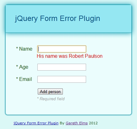
I’ve had two problems with this approach :
- The insertion of the message makes the whole form increase in size. This is a visually jarring experience for the user but there is another problem with this.
- If you type in some invalid data and then press the submit button the first even to fire is the control’s change event. If the user has just corrected some data (a common pattern just prior to pressing the submit button) a validation message may be removed from underneath the control thanks to the control’s change handler. The whole form then shrinks a little and the mouse click, whose event fires next, is no longer on the submit button. The button has moved! So you have to click it again. This is an annoying and confusing user experience.
Finally
I did start with the qTip jQuery plugin for these messages but I wanted something simpler whose HTML I could control.
Creating A Modal Dialog In A Backbone.js Kind Of Way
	$("#addPersonButton").click(
function( event) {
   // Create the modal view
   var view = new AddPersonView();
   view.render().showModal({
         x: event.pageX,
         y: event.pageY
   });
});
I’m finally using Backbone.js. It’s brilliant and I can’t recommend it enough. Backbone is not trivial but it solves a difficult problem.
So I needed a modal dialog. I messed about with a couple of modal dialog plugins but had problems getting them to work in a way that fits in with Backbone.js. After finding out how easy it is to create your own modal dialogs I decided to create a new Backbone.js view from which other views can derive and inherit modal functionality.
You can download a demo of my Backbone modal view from my Github page which looks like this :
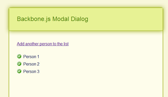
The demo doubles as a basic demonstration of Backbone.js and of my modal view. When you click “Add another person to the list” a Backbone view is created which derives from ModalView. This gives the child Backbone view a showModal() method. You just render your view as normal and then call showModal(). For example here is the click handler for the add person button :
	$("#addPersonButton").click(
   function( event) {
      // Create the modal view
      var view = new AddPersonView();
      view.render().showModal({
         x: event.pageX,
         y: event.pageY
      });
   });
The AddPersonView class extends my ModalView class like this :
	AddPersonView = ModalView.extend({
    name: "AddPersonView",
    model: PersonModel,
    templateHtml:
        "<form>" +
 "<label for="personName">Person's name</label>" +
 "<input id="personName" type="text" />" +
 "<input id="addPersonButton" type="submit" value="Add person" />" +
 "</form>",
    initialize:function() {
      _.bindAll( this, "render");
      this.template = _.template( this.templateHtml);
   },
    events: {
      "submit form": "addPerson"
   },
    addPerson: function() {
      this.hideModal();
      _people.add( new PersonModel({name: $("#personName").val()}));
   },
    render: function() {
		$(this.el).html( this.template());
		return this;
	}
});
Because AddPersonView extends ModalView you can call showModal() on your view and this happens :
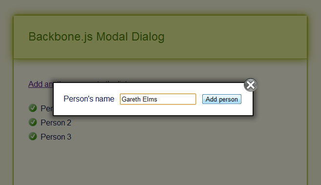
What you’re seeing is the el property of the AddPersonView instance being rendered into a modal container which gives you a few things for free :
- You can close the dialog by either pressing escape, clicking outside of the dialog or pressing the close icon
- The background is shaded back to highlight the modal view
- The focus is automatically set on the first form control in the modal view
- The modal dialog is, by default, positioned in the centre of the screen
In this example I’m positioning the dialog at the mouse cursor coordinates at the point when you click the “Add another person to the list” button. You can pass an options object to showModal() which gives you a bit of control of the internals of the modal dialog code. Here are the defaults that you can override :
	defaultOptions: {
	fadeInDuration:150,
	fadeOutDuration:150,
	showCloseButton:true,
	bodyOverflowHidden:false,
	closeImageUrl: "close-modal.png",
	closeImageHoverUrl: "close-modal-hover.png",
}
And as you have seen you can also pass in x and y properties. Hopefully these options are self explanatory except perhaps bodyOverflowHidden which helps the dialog stay on screen. The new Twitter add new tweet dialog does something like this too.
The demo includes two images that represent the close button and its hover state (it goes red when you hover over it). You can override the images easily through the showModal() parameter.
Back to the demo
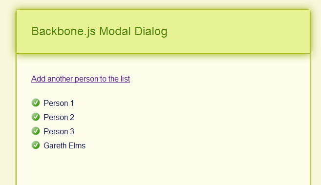
If you type a name in and press the Add person button then a person model is added to the person collection. Because this is Backbone.js this automatically triggers the rendering of a new PersonItemView into the PersonListView :
I’m Happy
I’m happy I stepped back and learned javascript properly and got into Backbone.js. I find that being self critical and determined makes you a better developer. Backbone.js forces you to break your UI down into small units and collections of units, each with their own set of event handlers. And it forces you to do this before you start creating your UI. This is crucial because it enforces design and forethought, the absence of which normally leads to big balls of code mud.
To learn Backbone.js I found the following resources useful :
- Joey Beninghove’s Backbone.js Quickly screencast
- PeepCodes Backbone.js Basics and Backbone.js Interactivity screencasts
- Tekpub’s Backbone.js APS.NET MVC 3 screencast
- Chris Strom’s stream of Backbone.js consciousness
- Nik Gauthier and Chris Strom’s Recipes With Backbone book
- The top quality Backbone.js documentation
- Rob Conery’s blog posts where he refactored the ToDo list demo
Finally I know that modal dialogs are known to be not in the best interests of usability but there is a subtle difference between true I-want-to-take-over-your-app-and-secretly-own-the-whole-world modal dialogs and these soft easily-closed dialogs. Facebook uses soft dialogs, as does Twitter. Use inline editing where it makes sense and a separate page where a modal dialog is being asked to do too much.
Download the code and demo from github or see the demo page live in action
Update: v0.3 is complete adding a few new features I needed.
ASP.NET MVC [Remote] validation – what about success messages?
Since ASP.NET MVC 3 it’s easy to validate an individual form field by firing off a HTTP request to a controller action. This action returns either Json(true) if the value is valid or a Json(“error message”) if it is not valid. If you return an error then jquery.validate.js will add your error message to the validation element for the field being validated. It’s easy to setup on your view model :
	[Required]
[DataType(DataType.EmailAddress)]
[Display(Name = "Email address")]
[EmailAddress]
[Remote("RemoteValidation_UniqueEmailAddress", "Account")]
public string Email { get; set; }
When the user makes a change to the Email field the /Account/RemoteValidation_UniqueEmailAddress action is automatically called on the server. The server side action is just as simple to setup :
	public ActionResult RemoteValidation_UniqueEmailAddress( string Email)
{
   object oResult = false;
   if( Validation.IsEmailAddress( Email) == false)
   {
      return Json( "Please enter a valid email address", JsonRequestBehavior.AllowGet);
   }
   else if( m_oMembershipService.IsThisEmailAlreadyTaken( Email) == true)
   {
      return Json( "This email address is already in use", JsonRequestBehavior.AllowGet);
   }
   else
   {
      return Json( true, JsonRequestBehavior.AllowGet);
   }
}
A remote validation error is displayed in exactly the same way as a view would render it. This is because the javascript latches onto the Html.ValidationMessageFor element you setup in your view :
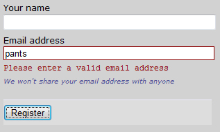
This is ok isn’t it? But…
I want the Email Address label to be bold and red too
In the interests of best practice web form techniques I want the email address label to be bold and red, as well as the error message. To do this I had to hack jquery.validate.js so that it calls a local javascript function with the same name as the server function (with “_response” appended to it) :
	remote: function(value, element, param) {
    if ( this.optional(element) )
        return "dependency-mismatch";

    var previous = this.previousValue(element);
    if (!this.settings.messages[element.name] )
        this.settings.messages[element.name] = {};

    previous.originalMessage = this.settings.messages[element.name].remote;
    this.settings.messages[element.name].remote = previous.message;

    param = typeof param == "string" && {url:param} || param;

    if ( previous.old !== value ) {
        previous.old = value;
        var validator = this;
        this.startRequest(element);
        var data = {};
        data[element.name] = value;

        $.ajax($.extend(true, {
            url: param,
            mode: "abort",
            port: "validate" + element.name,
            dataType: "json",
            data: data,
            success: function(response) {

                //START OF HACK
                var aParts = param.url.split(/\//);//eg; param.url = "/Account/RemoteValidation_UniqueEmailAddress"    ELMS
                oCustomResultFunction = aParts[aParts.length - 1] + "_response";//ELMS
                //END OF HACK

                validator.settings.messages[element.name].remote = previous.originalMessage;
                var valid = response === true;

                if ( valid ) {
                    var submitted = validator.formSubmitted;
                    validator.prepareElement(element);
                    validator.formSubmitted = submitted;
                    validator.successList.push(element);

        //START OF HACK
        var bShowErrors = true;
        if( typeof(window[oCustomResultFunction]) == "function")
        {
            bShowErrors = window[oCustomResultFunction]( true, null, validator);
        }
        //END OF HACK

        if( bShowErrors)//HACK
        {
            validator.showErrors();
        }

        }
        else
        {
            var errors = {};
            var message = (previous.message = response || validator.defaultMessage( element, "remote" ));
            errors[element.name] = $.isFunction(message) ? message(value) : message;

            //START OF HACK
            var bShowErrors = true;
            if( typeof(window[oCustomResultFunction]) == "function")
            {
                bShowErrors = window[oCustomResultFunction]( false, errors, validator);
            }
            //END OF HACK

            if( bShowErrors)//HACK
            {
                validator.showErrors(errors);
            }
        }

        previous.valid = valid;
        validator.stopRequest(element, valid);
    }
}, param));
        return "pending";
    } else if( this.pending[element.name] ) {
        return "pending";
    }
    return previous.valid;
},
And now a client side javacsript function called RemoteValidation_UniqueEmailAddress_response will be called with the result of the remote validation. In this example I know that the function only targets the Email field but it’s wise to check the errors collection that comes back in case other model errors were added in the server function (see the outcommented code below). The aErrors collection is keyed on the client side ID of the invalid field/s :
	function RemoteValidation_UniqueEmailAddress_response( bIsValid, aErrors, oValidator)
{
    if( bIsValid == false)
    {
        /* This bit is optional
        for( var sId in aErrors)
        {
            $("label[for=" + sId + "]").addClass( "error").css( "font-weight", "bold");
        }*/

        $("label[for=Email]").addClass( "error").css( "font-weight", "bold");
    }
    else
    {
        $("label[for=Email]").removeClass( "error").css( "font-weight", "normal");
    }

    return true;
}
The first argument to the function is whether there is an error or not. The second parameter is the errors collection. Now when I enter an invalid email address my form looks like this
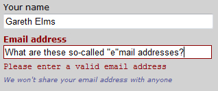
That’s better but something is still bothering me
Success messages would be nice
As well as catering for validation errors you now get the chance to provide success feedback as well which can be just as important as error feedback. For example if the user is registering on a site and choosing a username the validation could check that the username is available. If it is then you can present a jolly green tick to the user. This completely removes ambiguiuty, especially if the previous username they entered was already taken and they saw a validation error
One last bit of code :
	var g_bEmailHasBeenInErrorState = false;
function RemoteValidation_UniqueEmailAddress_response( bIsValid, aErrors, oValidator)
{
    if( bIsValid == false)
    {
        $("label[for=Email]").addClass( "error").css( "font-weight", "bold");
        g_bEmailHasBeenInErrorState = true;
    }
    else
    {
        $("label[for=Email]").removeClass( "error").css( "font-weight", "normal");

        if( g_bEmailHasBeenInErrorState)
        {
            g_bEmailHasBeenInErrorState = false;

            $("#Email").after( "<img style='float:left;' src='<%=Url.Content( "~/Content/img/tick.gif")%>' alt='This is a valid email for this web site' />");
        }
    }

    return true;
}

Hang on a minute. Why isn’t this functionality in jquery.validate.js anyway? Go to your room!
I didn’t refer once to AJAX because :
- XML is moribund everywhere but the enterprise.
- IE had javascript HTTP requests before the web existed.
- Prior to that you could just screen scrape a hidden iframe for crying out loud!
