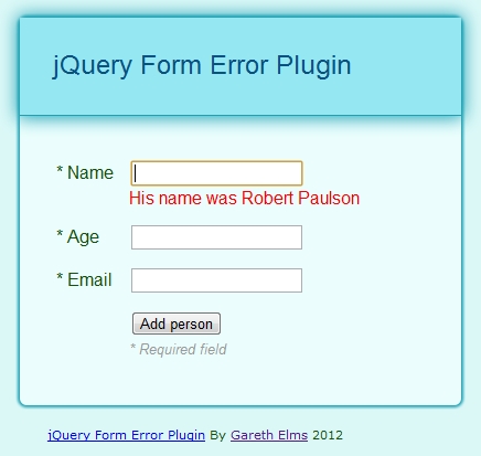
Using jQuery to display a form validation error
I’m obsessed with best practice form design and usability. There are lots of guidelines about validation messages.
I’ve decided on a way of displaying validation errors and success messages on forms for my current project. I’ve turned this into a jQuery form error plugin on GitHub which provides some quick wins :
- A single function call to display a validation message next to a field.
- A single function call to remove a validation message and optionally displays a success image in its place.
- No additional css is required.
In the GitHub project you’ll find the Index.html which demonstrates a simple form with some validation. Here’s a video of the plugin in action :
How do I use jquery.formError?
First of all you need to know when a form control has invalid data because it’s then that you want to call the plugin. I’ve kept the validation logic in the demo simple so the focus is on the plugin. If you’re using Backbone.js I can recommend the excellent backbone.validation plugin as it has the required valid/invalid callbacks you’ll need.
First you’ll need to include the jQuery.formError.js plugin javascript file. Then, to display a validation error message on an input with an id of “name” :
	$("#name").formError(
	"Name cannot be greater than 15 characters long");
To remove the validation message when you have successfully revalidated the value :
$("#name").formError( {remove:true});
By default removing the validation message will place a validation success image in place of the error. So you’ll need an icon for this like the one in the demo. To disable this behaviour :
	$("#name").formError({
   remove:true,
   successImage: {enabled:false}
});
The default image url is just “success.gif” which you can easily modify on a per-call basis :
	$("#name").formError({
   remove:true,
   successImage: {src:"img/success.gif"}
});
The plugin also gives an invalid control the css class invalid. I leave it up to you to decide the visual effect .invalid has on the control. In the demo.css file you’ll see that it applies a red border. This css class is removed when you remove the error message.
Why not put the validation message underneath the control?
It’s common for web forms to put their validation messages directly underneath the invalid control. Like this :

I’ve had two problems with this approach :
- The insertion of the message makes the whole form increase in size. This is a visually jarring experience for the user but there is another problem with this.
- If you type in some invalid data and then press the submit button the first even to fire is the control’s change event. If the user has just corrected some data (a common pattern just prior to pressing the submit button) a validation message may be removed from underneath the control thanks to the control’s change handler. The whole form then shrinks a little and the mouse click, whose event fires next, is no longer on the submit button. The button has moved! So you have to click it again. This is an annoying and confusing user experience.
Finally
I did start with the qTip jQuery plugin for these messages but I wanted something simpler whose HTML I could control.
